

If you are a member of the blog site Medium, you get recommendations for articles to read based on the topics you say you’re interested in. For me, most of these recommendations fall flat. They don’t hold my interest. It’s not always the content (or lack thereof), or the voice, or any of the things blogs on writing tell you to do (or not do). It’s formatting and graphics. I find plain text to be mind-numbing.
How I Got So Out-Of-Whack
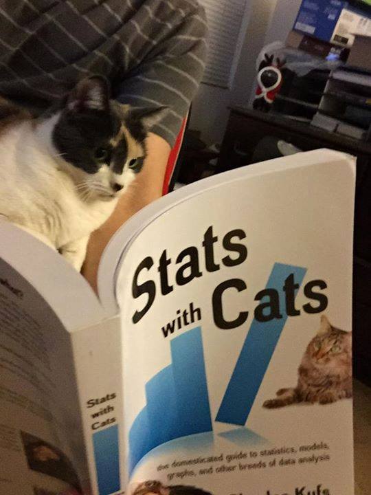
I grew up reading comic books thanks to Stan Lee and my very understanding parents. I certainly didn’t read them exclusively, but comics were way more engaging than anything I found in the library. My post high school education was in science (geology) and math (statistics). That gave me near-fatal damage points to start off with. I worked for 42 years, 16 for the federal government, writing technical reports that management never read. I told myself that that was OK since I still got paid. At my first job, I was lucky to have a mentor, Ed Saltzberg, who broke me of the bad habits I learned in school and sent me on a decades-long exploration of technical writing. I eventually published “How To Write Data Analysis Reports In Six Easy Lessons” to end my quest. I wrote a book too, but that’s another story.
During those years, I read mostly non-fiction—technical reports, text books, how-to books, coffee-table books, backs of cereal boxes, instructions for completing government forms, and the like. Formatting and graphics were everything. Blocks of text in even the most fascinating statistical report would cause me to check my eyelids for pinholes. Even today, two years from writing those hard-core technical reports, I still crave headings, and bullets, and images, and most of all, charts and graphs. While I love @Daylin Leach on Medium, even his captivating commentaries require me to take rest stops.
In the technical reports I wrote in the past, I followed the old admonition of Aristotle, Dale Carnegie, the military, and others, “tell ’em what you’re going to tell ’em; tell ’em; then tell ’em what you told ’em.” I would first develop an outline that told the data’s story, assembled all the tables and graphics I needed, then did the writing. Once I found Word had a function to insert a Table of Contents, over a decade ago, I put one in all my reports. That encouraged logical and frequent headings.
My aim in writing those reports was to devote as much area to visuals as to text. I broke up text with lists, indents, and text boxes. Just as importantly, I tried to make each paragraph efficiently convey a coherent thought, or even connected thoughts, without rambling. I didn’t tell many personal stories because technical reports are about data stories. I also never used any dialog balloons although I thought of it at times.
What I Would Look For
If you read a lot of fiction, your blogs probably look like a novel even though they are likely to be non-fiction. They are a train of block paragraphs. Hopefully the blocks are different sizes and maybe even separated by headers but maybe not. It is, however, what you’re most familiar with know and what most blogging sites are set up for.
But, if I were to curate your Medium article, this is what I would look for:
- First Glance. In the first minute of my curation, I’d notice:
- Title. Is the title less than one line and engaging enough to make me want to read more?
- Length. Long is OK depending on the topic. I just need to get some coffee if there’ll be too much scrolling involved.
- Headings. Long blogs should be broken up with headers. My rule-of-thumb is a heading for every 300 words or so. The organizational breaks need to be somewhat uniform and make sense given the content.
- Visual Impact. This is my decision point. If it looks more like a comic book than a novel, I’ll keep reading.
- Writing. OK, now I actually have to read the article. This pisses me off. I’m retired; I should be watching Netflix. So, the article better be free of any more than an occasional typo. Grammatical errors get a strike; you’ll get three. Hopefully you’ll avoid all the shameful errors the grammar Nazis warn you about—to/too/two/tutu, your/you’re, their/there/they’re, its/it’s, assure/ensure/insure, who/that, which/that, and so on. Lead/led isn’t the same as read/read. For some reason, using less/fewer incorrectly really sets me off. Don’t do that. I’ll ignore the things I do wrong all the time. It’s OK to boldly split infinitives. Passive voice is used by many. Nobody gets who/whom right. And, I could go on forever about comma splices and run-on sentences.
- Content. My blood sugar is high so I’m already falling asleep. Now I have to concentrate on what you’ve written. This is irritating. The content has to be truly engaging. If it’s a data story, it better be logical, consistent, and complete. Jargon is OK if you tell me what you think it means. How-to articles have to have clearly delineated steps that actually work. Personal stories are fine if we have some common interests. I don’t want to hear about your dinner, or your vacation, or your kids. Pet stories get a pass even if I don’t read them.
- Graphics. This is where I would make most people hate me. For me, blog graphics are diamonds radiating their information from the dull groundmass of text. Photos are probably the most common graphic bloggers use, though they aren’t necessarily the best. Tables usually pack more information but they can cause mental overload. There are also: Visualizations involving plots, charts and graphs; Infographics with diagrams, flowcharts, and visualizations; Drawings, illustrations, schematics, clipart, comics, and memes; and Text Boxes with quotes or formulas. Make sure the graphics are attractive and add to the story.
- Formatting. I like interesting and sensible formatting to keep my interest. Unfortunately, Medium’s utility for writing blogs has limited formatting capabilities. You can’t indent, change typefaces, add highlighting and font art (except for drop caps), or use subscript, superscript, small caps, or strikethrough. You’re left with headings, drop caps, quotes, block enlarge and reduce, separators, bolding, italics, and links. Do what you can.
So, stop complaining about Medium’s curation. It would be much worse if I were a curator.

